If you’ve been around my social media for a while, you know that limited color palettes are one of my fav things to talk about.
But why? In this blog post, I’ll go through all the reasons WHY you wanna work with a limited color palette, then I’ll share my favorite tips about HOW to choose a limited color palette that fits you and/or the project that you’re currently working on.
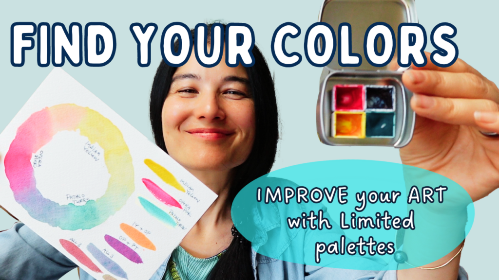
I’ll also show you my favorite mini palette of Opera pink, Indian yellow, phtalo turquoise and indigo. This post focuses on watercolor but naturally you can apply these tips for other media, too
(well, to a certain degree. WC are transparent, so for media like acrylic paint or gouache, you’d add white and black to your palette to achieve a variety of color values).
Back to limited palettes!
Why would anyone want to choose to work with a limited amount of colors such as the classic 3 primary color palette when there are soooo many premade and premixed colors out there?
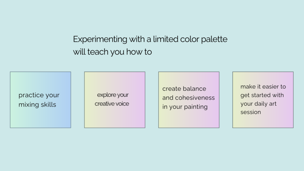
– 1 First of all, the learning factor!

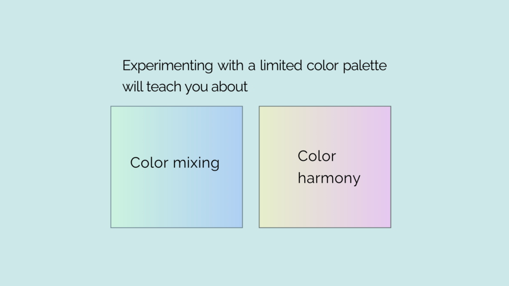
Having only a few colors at your disposal will teach you about color mixing and color harmony.
When I rediscovered my love for painting 7 years ago I worked with a limited palette from the get go and it made me understand how to mix all sorts of different colors, and which colors work well together. And, as a side note, It also really helped with my job of creating watercolor paints and palettes for my Alohawatercolors business.
So even outside of painting, think of interior design, clothes, making greeting cards, or designing a website. Knowledge about colors always comes in handy.
– 2, color harmony!
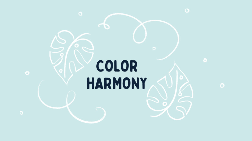
A limited color palette will lead to a more balanced painting. Let’s say you use the classic blue, red and yellow primary palette and mix your own green, orange, purple and neutral colors from that: these greens, oranges, purples and neutrals will automatically go well with each other, as they all stem from the same three colors.
So you could paint a whole series of artwork with different subject matters but using the same colors and their mixes and that will unify the series and create harmony and cohesiveness.
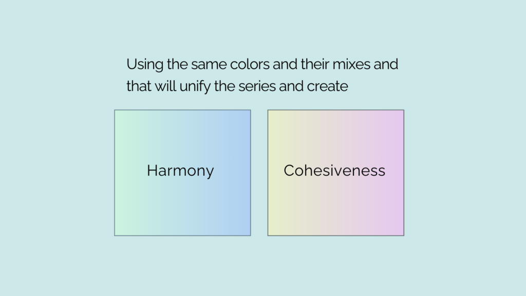
And even if you don’t mix your colors and use the colors straight from the palette you picked, the series of paintings will look unified colorwise.
– 3, simplify your decision making process.
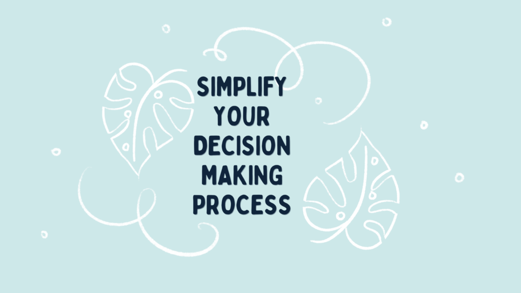
Especially for challenges like a 30-day challenge, I love having my color palette set and ready to go so that every day I can just reach for my toolbox, with all my supplies and colors right there.

No more pondering which colors to choose, that job’s already done and I can get started with painting. If you wanna know more about how to set up a daily art challenge, check out my video from last week, and I’ll put a card up here so you can have a look, if you like.
– And I wanna say at this point that I know it can be challenging to mix all the colors all the time when you’re limited to using just three or four colors. You may come up with a perfect shade of green and then try and remix it and it just doesn’t come out the same way. Frustrating! And if that keeps you from painting, then I would recommend to add a few so-called convenience colors. These are paints that are premixed so you don’t have to.
Which is what I did here in my mixed Media challenge back in May. I had three primary colors, or I should say a more modern trio of primaries: a magenta, blue and yellow. And then I added a few colors that I knew I would need throughout the challenge. And yes I could have mixed this avocado color easily with this yellow and blue but having it right there was very convenient. And because I used other media as well such as colored pencils and crayons it was handy to have a few additional colors ready to go with these media, too.

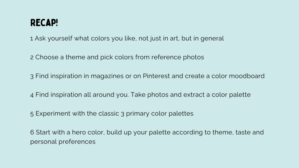
To RECAP:
Now that we looked at why you wanna choose a limited color palette, let’s look at HOW to choose one.
For me, choosing colors is very intuitive. I’ve been a watercolor paint maker since 2017, and I think a lot about colors and experiment with color palettes on a daily basis. Color preferences might change over time. Or they change according to what mood you’re in, which season it is, or if you’re at home or traveling. There’s no right or wrong if you ask me, but there are few good methods to choose a color palette when you’re not sure where to begin:
1) Let’s start with a general idea of what you like.
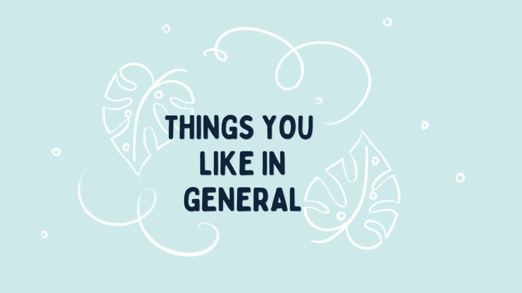
Are you drawn to calm and cool scenes, not just in art but in general? Looking at the blue ocean or a serene lake and forest gives you all the good vibes. Or maybe you love all the bright colors, you even love wearing them. Or you feel drawn to more muted and warm colors in the yellow and peach range. Or you’re just wild and love to mix it up. A calm and cool blue background with some really bright colors up front.
Understanding what you feel drawn to might even make your decision on what to paint easier.
You might already know what you love to paint. Is it landscapes, portraits, animals? Or maybe you love creating sweet illustrations, or perhaps you’re a pattern designer? Do you love to paint realistically or are you going for more abstract or stylized art?
Finding out not just which colors you like but also what you enjoy to draw can help you find your favorite color palette. Or palettes. Doesn’t have to be just one of course.
2) Let’s get a bit more specific.

Let’s say you love cool and calm blues and greens and decide to paint ocean scenes. Or you love bright and punchy colors and want to do a 30 day challenge of painting tropical flowers with lots of contrast.
Next step you can look at a few reference photos and pick some vibrant greens, reds and yellows for the tropical flowers and lots of blues for the ocean.
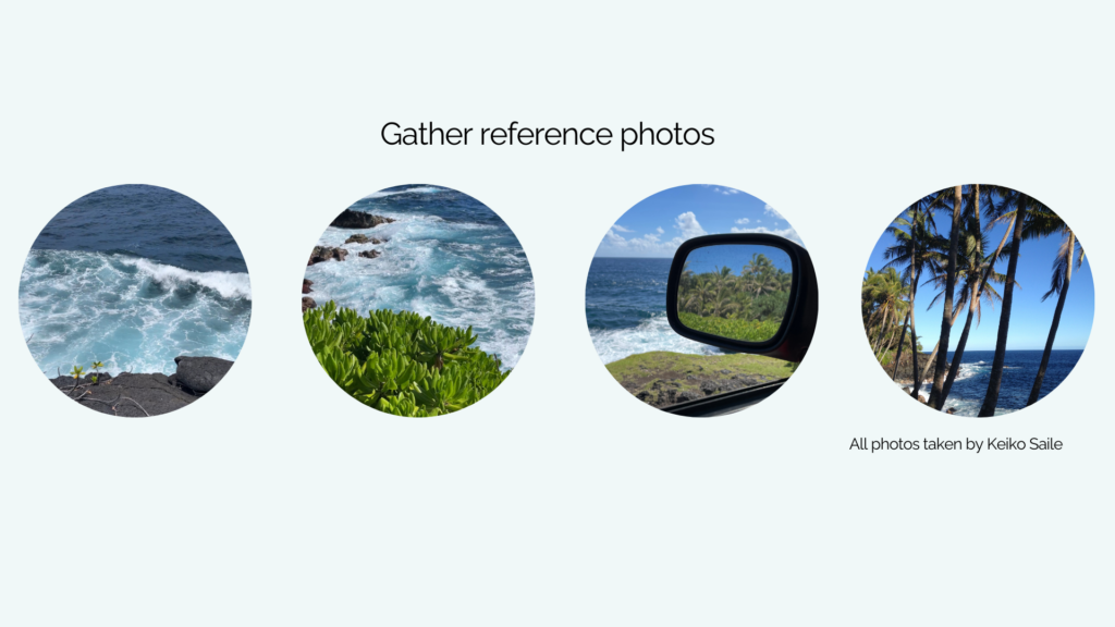
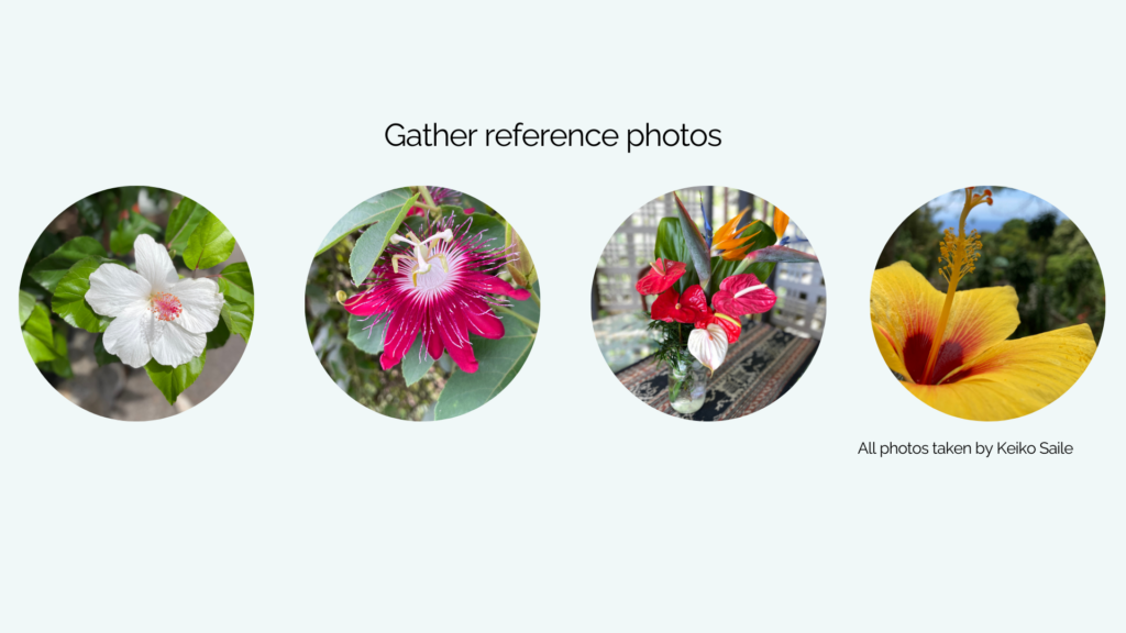
If you work with reference photos, you can use the free tool Adobe color to upload the photo and have the app pick a color palette right from that photo.
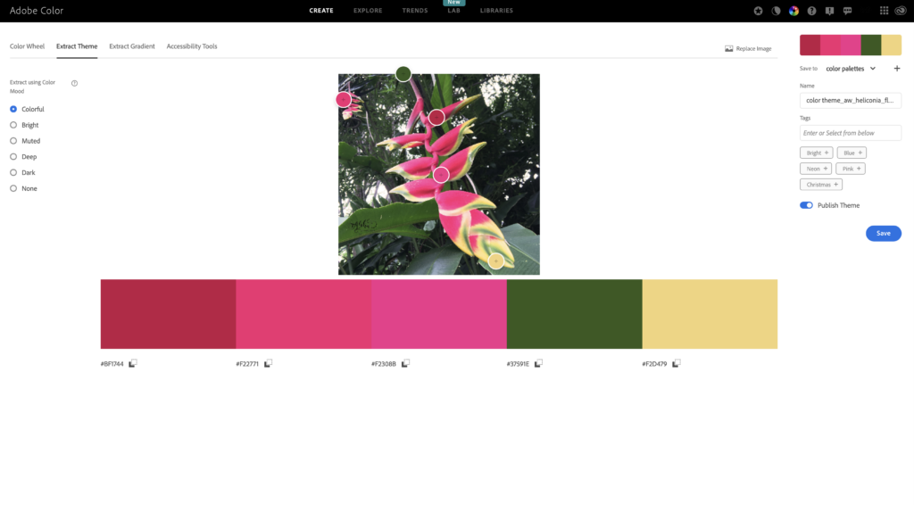
You can change colors by moving them around the photo, you can move the swatches and even choose from different modes here in the left panel, from colorful, bright to muted, deep and dark. This Adobe site is free to use. However the free version doesn’t let you save your palette, so I recommend that you take a screenshot before you try out the next photo.
3) Another interesting way to explore what colors speak to you is to open a magazine and mark the spots or even cut out a few swatches that you like intuitively.
Then lay them out in front of you and start combining them, taking away some swatches, or adding more, until they feel right. You can create a mini colormood board like this on Pinterest too.

Coming back to painting oceans or tropical flowers, you can peruse the magazine with the idea of finding blues and greens for the ocean, and bright and fun colors for the flowers. But you can keep it more spontaneous too, especially if you don’t have a certain theme in mind and maybe just want to paint something abstract.
4) Naturally, you can find color inspiration all around you, not just in a magazine or on Pinterest.

If you love flowers and see a certain color scheme that you like, take a photo and extract a palette with Adobe color. This is a method I learned from the one and only Bonnie Christine, a surface pattern designer who shares so much of her knowledge

She says that you can always look to nature to come up with the most wonderful and cohesive color palettes. And she recommends to always pick a few saturated colors but also choose at least two neutrals or desaturated colors, both light and dark.
5) If you’ve never worked with a limited color palette and want to learn how to mix colors from scratch, you can start with the classic primary colors blue, red and yellow, or, as I’ve mentioned earlier, the printing industry primaries of cyan, magenta and yellow.

The big watercolor brands – and lots of handmade watercolor paint makers as well – offer basic color sets with cool and warm primaries that let you mix a whole rainbow of colors.

If you’re new to color mixing, you might not be familiar with the term warm and cool colors. This could be a whole video by itself so I just briefly want to say that in a nutshell and very generally speaking, we perceive blue, green and purple as cool colors.
Yellow and orange and reds are considered warm colors.
BUT! Even a cool color like blue can lean towards being a warm color when it has a hint of a warm color in it. For example ultramarine blue has a reddish hue to it and is therefore considered a warm blue. And of course a purple with a red hue will feel more warm than a purple that has more blue in it. And a green with a yellow hue will be perceived as a warm color, too.


left: warm purple
right: cool purples
There’s a whole science on how to mix cool and warm primaries to create more muted or vibrant greens, oranges and purples. As I said that could be a whole video in itself, and the reason I’m mention the primaries at all is that they are extremely versatile and will let you mix an incredible range of colors.
For me personally, I hardly use red, I go for a bright pink or magenta, or, my favorite, Opera pink which contains quinacridone magenta and neon pink. But in my method, I kinda stick close to the idea of primary colors, but I like to change things up a little bit.

6) My method
What I usually do is choose colors that are close to the primary colors. Then I add a couple of neutral colors, usually a dark and a lighter one.
I start with one color, the hero color. In this case, opera pink. Opera pink on the color wheel would be between red and purple. Following the model of the primary colors arranged in a triangle, or also known as a triad, I then substitute the blue for a phtalo turquoise, and the yellow with an Indian yellow.
I could work with just these three colors and create beautiful mixes. These swatches here show a few examples of oranges, purples and neutrals you can mix with just these three.

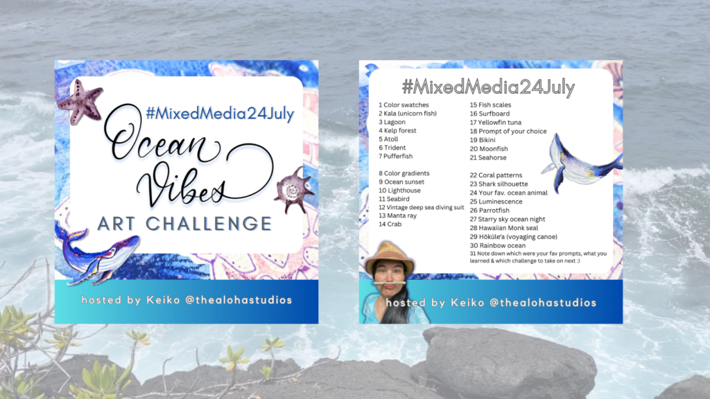
As I will be using this palette for my upcoming Mixed media challenge over on Instagram, I want to add another type of blue to the palette. The challenge’s theme is Ocean vibes so indigo feels like a very convenient color to add to the mix. It’s also a very dark color which will allow me to create darker values of all my chosen colors for this palette.

As a side note: When you work with watercolor, you can utilize the white of the paper to create even more variations of color saturation. For example you can water down this Phtalo turquoise to a very faded looking light blue.
For my own palette creation, I combine my love for bright colors, but I also look at the things that I want to paint with it. So, having Ocean vibes as the theme with prompts ranging from ocean animals, surfing to ocean landscapes I wanted to have a versatile palette that lets me create a wide range of colors. I added indigo as a convenience color, and I might actually end up adding a primary blue such as ultramarine blue, because I love granulating colors and so far all 4 colors in my palette, the phtalo turquoise, indian yellow, opera pink and indigo are non-granulating paints.
I hope you find this post encouraging to try out a limited color palette, play with it, maybe for a month and see where it leads you and what you can learn from it. If you’d like to join me next month for the MixedMedia24July, hop over to my Instagram @thealohastudios.
If you’d like to watch a video about this topic, head over to my Youtube channel to watch the limited color palette video there: